

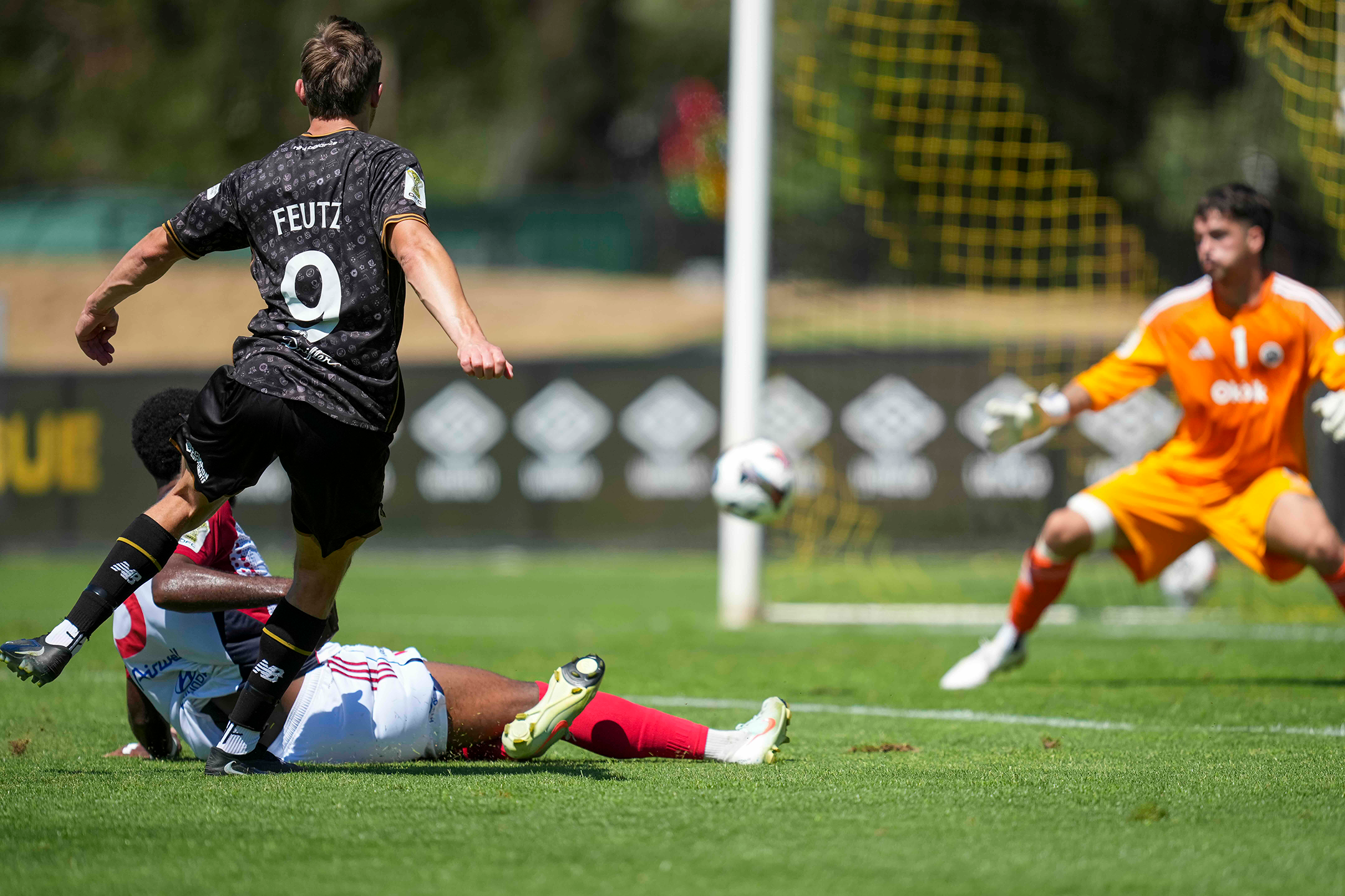
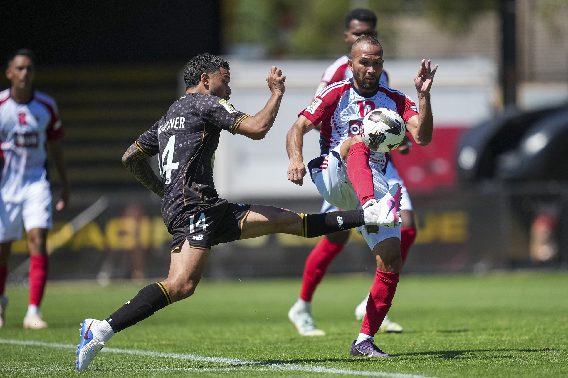
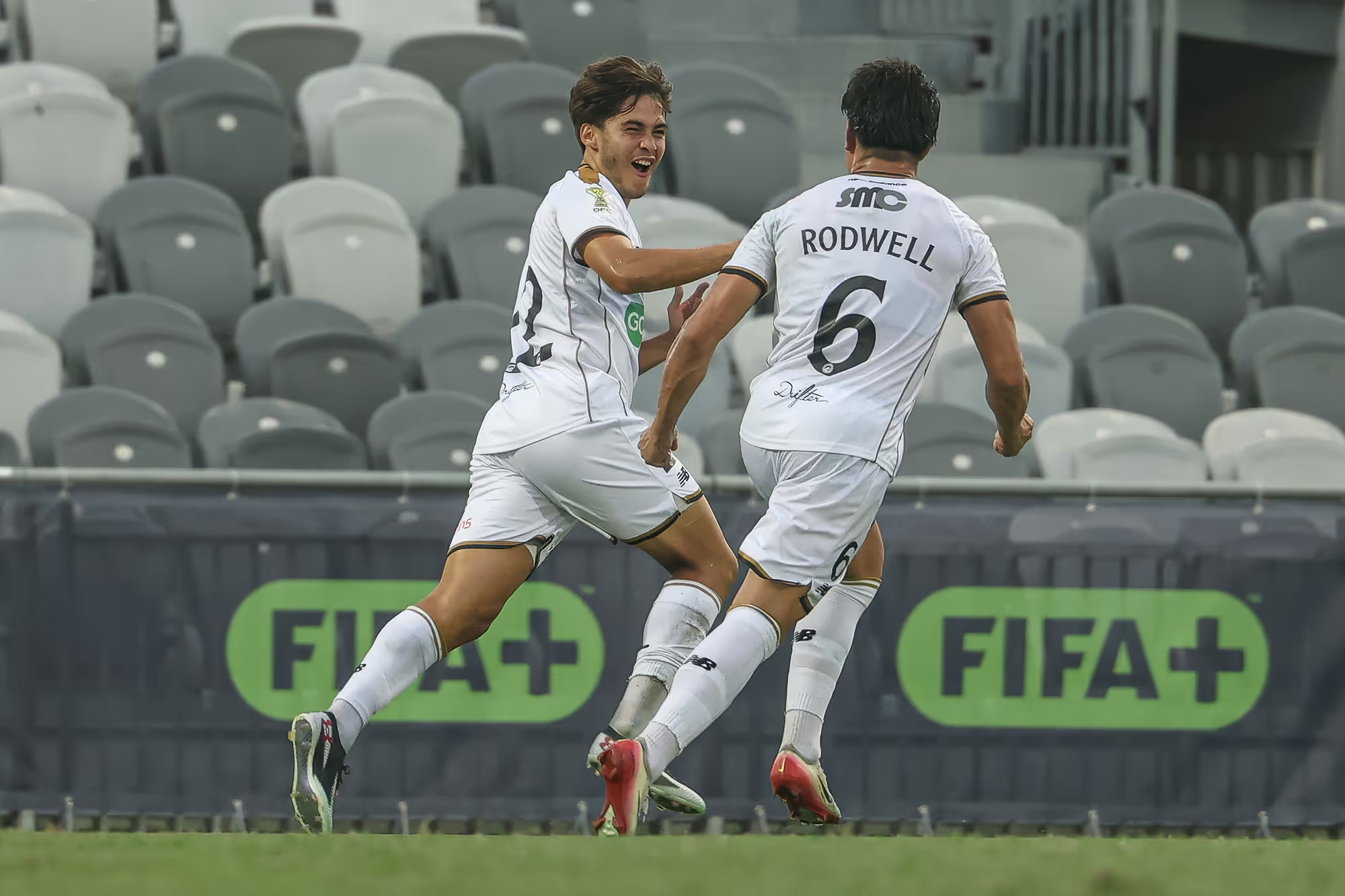
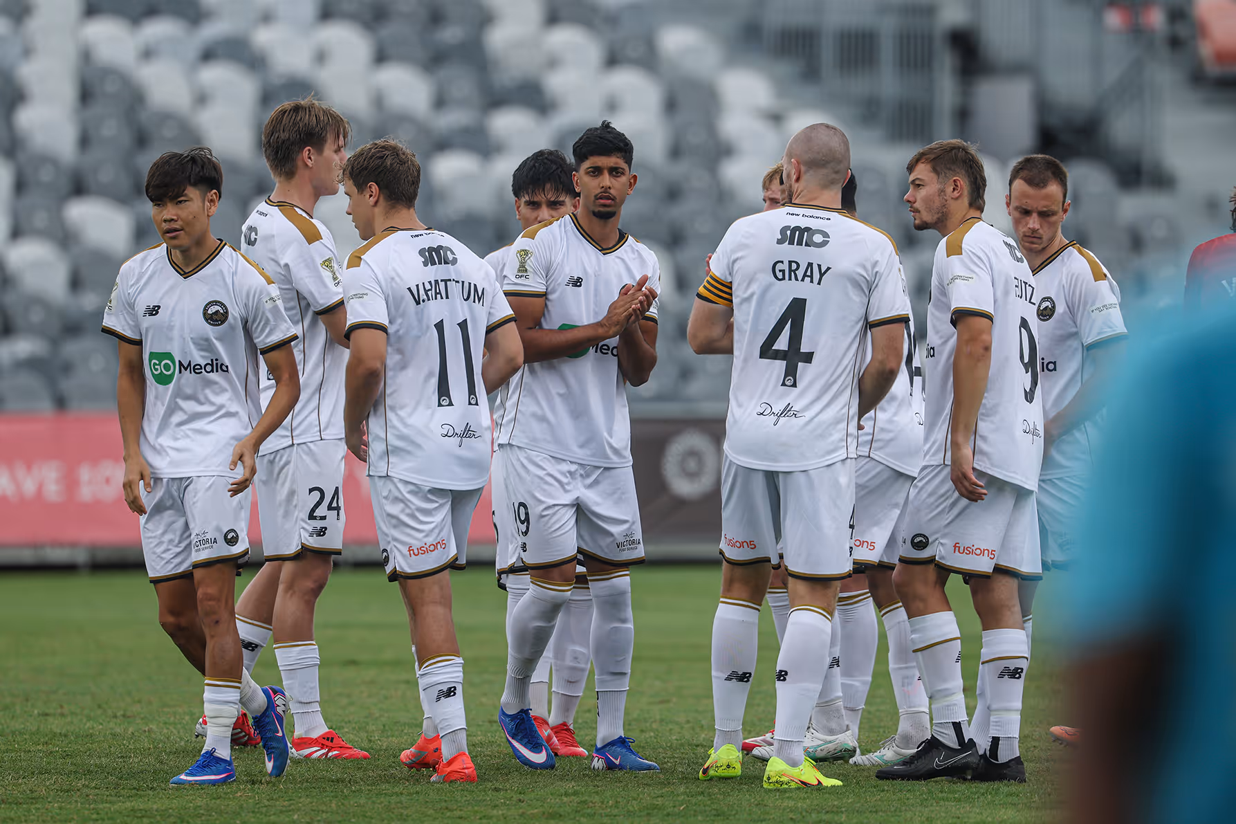
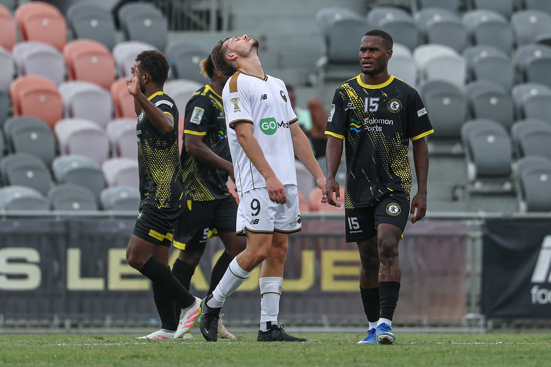
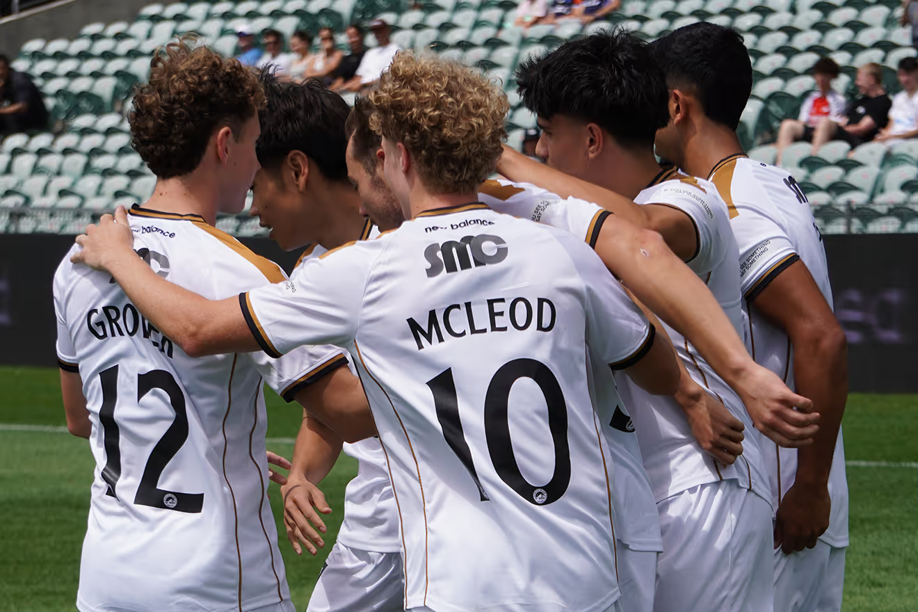
South Island United has unveiled its new logo for the OFC Pro League that captures the natural beauty of the region and the unified support for the first professional football team in the Mainland of New Zealand.
South Island United Chief Executive Ryan Edwards says the new club has taken its time to create a symbol that would truly represent the football community and its position in the world.
“We worked with a top international creative agency to guide us through the process and have been liaising closely with coaches, players and other stakeholders inside and outside the club to make sure we got this right,” says Edwards, who adds that the club opted for a more traditional round logo, instead of a monogram.
“It is our goal to create a unified voice for the South Island football community and we think the round shape represents that we are stronger together.”
Edwards says South Island United wants to be more than a club and needed a logo that embodies the pride, resilience and spirit of the South, from the coast to its peaks.
“We believe the Southern Alps represents the spine of the South Island that holds us all together and gives strength, determination and a sense of belonging for every South Islander.
“Our backyard is one of the most stunning and recognisable settings on the planet, so it was an easy choice to wear that on our chest.”
The Chief Executive explains that adding the Southern Cross celebrates South Island United’s unique position in world football, as one of the most remote professional football teams on the planet.
“When we look at the Southern Cross above us, we immediately know we are home,” says Edwards, who adds the stars also represent the ambition of the most innovative football club in the country.
“We may be small and may be new in professional football, but we have big dreams and want to reach for those stars.
“Very few people believed we could create a professional football team in Christchurch, and look where we are now, only weeks away from kicking off our first match in the OFC Pro League.”
Edwards says the primary colours of black and white were chosen to incorporate all the clubs in the South Island.
“Black represents unity, but is also a homage to the coal mining heritage that is such a big part of South Island history,” says Edwards.
He explains that t the white colour represents the club’s appetite for innovation as they step into the brave new world of the OFC Pro League.
“And of course it reflects the Long White Cloud in our sky and the snow-capped mountains of the South.”
The club was also keen to incorporate gold, as the universal colour of ambition.
“Just like the brave prospectors during the gold rush in the 1860s on the West Coast and Otago, we will be chasing gold in the OFC Pro League.”
Other news
Discover the latest insights and updates from our football club


.jpg)


.jpg)


.avif)
.avif)
.avif)

.avif)
.avif)
.avif)

.avif)


.avif)